REPORT: The Frontline AI Gap – is AI reaching the frontline?
How to Build a Great Internal Communications Dashboard [Key Functionalities, Metrics to Include & Examples]
April 22nd 2026
For years, the success of an internal communications team was measured by soft feedback or gut feeling.
Today, communication professionals are expected to prove their ROI just like their counterparts in Sales or Marketing. The challenge, however, is not a lack of data – it’s a lack of clarity. Most teams are drowning in scattered metrics: email open rates in one tool, intranet logins in another, and employee feedback buried in spreadsheets.
When your data is siloed, you cannot see the full picture of your company culture. You’re reacting to the past rather than managing the future.
This is where a great internal communications dashboard transforms your function. By consolidating these disparate data points into a single, real-time view, you move from simply reporting on communication efforts to making informed decisions that drive business strategy.
In this guide, we’ll break down the essential functionalities of a modern internal comms dashboard, the exact metrics you should be tracking, and real-world examples of how to visualize success.
What is an internal communications dashboard?
At its core, an internal communications dashboard is a centralized analytics tool that tracks, visualizes, and analyzes internal communication metrics across your organization.
It acts as a single source of truth, aggregating data from multiple communication channels – such as your company email, intranet, mobile app, and survey tools – to provide a comprehensive view of performance in real-time.
Traditionally, reporting on comms performance meant spending hours manually exporting data into Excel and pasting charts into PowerPoint. By the time these static reports reached leadership, the data was often weeks old.
A modern dashboard changes the game through automation. It continuously monitors the pulse of your organization, allowing communication professionals to:
- Spot trends instantly: Identify a sudden drop in readership in a specific region before it becomes a problem.
- Measure true impact: Go beyond activity to see how specific initiatives influence company culture and employee engagement.
- Make informed decisions: Pivot your internal comms strategy based on live data rather than waiting for a monthly review.
5 Key functionalities of an internal comms dashboard
Not all dashboards are created equal. A basic tool might tell you how many people opened an email, but a modern dashboard helps you understand behavior.
To truly optimize your internal communication strategy, your dashboard needs to offer these five core functionalities:
1. Real-time content performance
You shouldn’t have to wait until the end of the quarter to know if a message landed. A powerful dashboard tracks communication efforts as they happen, allowing you to see which formats (video vs. text) and topics are generating the most interest. This allows you to pivot your strategy instantly rather than relying on outdated data.
2. Granular audience segmentation
A company-wide average often hides the truth. If your global engagement is 80%, but your Engineering team is at 20%, you have a blind spot. A great dashboard allows you to filter data by department, location, or tenure, helping you identify exactly which groups are disengaged so you can target them with specific initiatives.
3. Adoption and activation tracking
High open rates don’t always mean high adoption. You need to know if employees are actually inhabiting the platform. Your dashboard should track distinct behaviors – such as daily active users, first-time logins, and posting frequency – to ensure the technology is actually being adopted by the workforce.
4. Integrated employee listening
Quantitative data (clicks) tells you what happened; qualitative data (sentiment) tells you why. The best dashboards integrate employee feedback tools, allowing you to launch pulse polls or analyze the sentiment of comments (positive, negative, neutral) to gauge the genuine mood of the organization.
Learn more → Why Employee Listening Is Important and How To Do It Right
5. Campaign-specific tracking
General engagement is useful, but sometimes you need to track a specific project. A robust dashboard allows you to isolate specific tags or campaigns – like “2026 Benefits Enrollment” or “Cybersecurity Month – to see exactly how that initiative performed compared to your baseline benchmarks.
Key benefits of using an internal comms dashboard
Here’s why investing in an internal communications dashboard is a game-changer for your organization:
- Make informed decisions: Instead of guessing which content type works best, you can use hard data to optimize your strategy. If video updates get 3x more engagement than lengthy emails, the dashboard gives you the evidence to pivot immediately.
- Prove value to stakeholders: Leadership speaks the language of numbers. A dashboard allows you to present clear ROI to the C-suite, demonstrating exactly how communication efforts are driving adoption, alignment, and company culture.
- Streamline reporting workflows: Manual data entry is a massive time sink. By automating the collection and visualization of metrics, your internal communications team saves hours every week, freeing them up to focus on creating great content rather than formatting PowerPoint slides.
- Identify risks early: Real-time visibility allows you to spot quiet quitting or disengagement trends in specific departments before they become retention issues. You can intervene with targeted support exactly where it’s needed.
- Create a feedback loop: By tracking sentiment and employee feedback alongside reach, you create a two-way street. You know not just if people are reading, but how they feel, allowing you to build a more responsive and inclusive workplace.
What should be included in your internal comms dashboard?
A dashboard is only as good as the data it displays. To avoid analysis paralysis, your metrics need to tell a complete story – from how many people saw a message to how it impacted their decision to stay at the company.
Here are the essential internal communication KPIs and metrics you should include:
1. Reach and channel effectiveness
These metrics tell you if your channels are working and if employees are actually seeing your content.
Email engagement rate: High open rates are good, but click-through rates (CTR) are better. The CTR is the percentage of employees who clicked a link, proving they actually interacted with the content.
Internal communication reach: This measures the extent to which your messages are penetrating the organization, helping you identify if specific departments are being left out of the loop.
Channel effectiveness: This helps you identify which platforms (email, intranet, mobile) are performing best so you can allocate resources to the channels employees actually use.
2. Sentiment and feedback metrics
These metrics help you understand how employees feel about the organization and whether they feel heard.
Survey response rate: A low response rate often signals a disconnect or survey anxiety. It isn’t just about the answers but the willingness to participate in the conversation.
Employee Net Promoter Score (eNPS): A quick scoring system to categorize employees into detractors, passives, and promoters. Higher eNPS scores generally correlate with higher loyalty and lower turnover costs.
Employee feedback implementation rate: This measures how responsive the organization is to suggestions. If you ask for feedback but never act on it, trust erodes, so tracking your action rate is critical.
3. Behavioral and adoption metrics
This category measures actual behavior change and comprehension.
Adoption rates for new tools: When rolling out new tech, this KPI tracks if the tool is actually adding value. If unique user logins are low, it may indicate a need for better training or gamification.
Employee advocacy and participation: This measures the extent to which employees actively participate in initiatives or events, serving as a strong indicator of alignment with organizational goals.
Knowledge retention: This tracks whether employees actually understood the message. It is typically measured through quick assessment questions following a major campaign.
4. Organizational health metrics
These are the big picture outcomes that internal comms ultimately influence.
Employee turnover rate: High turnover, especially in the first 90 days, often signals a broken onboarding communication process. Tracking this helps you correlate communication strategy with retention.
Absenteeism: High rates of unplanned absence often point to a negative work environment. Monitoring this helps you identify disengaged teams before productivity suffers.
Internal communication dashboard examples
To truly understand the performance of your internal communications, you cannot rely on a single metric. You need specific views for specific goals – from tracking daily engagement to monitoring long-term adoption.
Here are the five essential dashboards you need to have a complete picture of your organization’s health:
1. Overview dashboard
What it shows: This dashboard acts as a quick health check to see how well your platform is performing at a high level. It should aggregate a mix of charts and graphs from your more detailed dashboards to give you a summary view.
The data here is typically updated daily, allowing you to scan performance without getting lost in the weeds.
Why it matters: It helps you identify areas that need deeper analysis immediately. Instead of clicking through five different tabs, you get a snapshot of your entire ecosystem in one place – perfect for quick updates to leadership.
2. Content analytics dashboard
What it shows: This dashboard provides a deep dive into how your content is performing. It identifies which posts are performing best (and worst), helping you understand what actually resonates with your audience. Beyond standard posts, this dashboard should also track engagement on interactive elements like competitions, polls, and badges.
Why it matters: It eliminates the guesswork from your editorial strategy. If you can see that gamified content (like competitions) drives significantly more interaction than standard updates, you can adjust your content plan to drive higher engagement.
3. Usage trends dashboard
What it shows: This dashboard focuses on behavior over time. It visualizes usage trends across the organization, allowing you to pinpoint specific teams or departments that have lower usage rates compared to others.
Why it matters: Engagement isn’t static. By identifying cold spots (teams with low usage), you can take proactive action – such as offering targeted training or support – to re-engage those employees before they become completely disconnected.
4. Onboarding & activation dashboard
What it shows: This dashboard tracks the first mile of the employee experience. It shows the levels of profile activation across your organization, highlighting which regions or departments are quick to get on board and which are lagging behind.
Why it matters: High theoretical reach means nothing if employees haven’t actually set up their accounts. This view helps you identify which groups need additional change management support during a rollout, ensuring no one is left behind.
5. Governance & security dashboard
What it shows: Unlike the other dashboards which focus on engagement, this one assists with the ongoing management and security of the platform. It contains reports on user Roles and Permissions, Space Membership, and Delegates.
Notably, while other dashboards update daily, this data is often updated hourly to ensure accuracy.
Why it matters: As your internal network grows, keeping it secure is critical. This view gives IT and admin teams the real-time visibility they need to manage access rights and ensure compliance without digging through complex logs.
How to build an effective internal comms dashboard
Building a dashboard isn’t just about aggregating data; it’s about designing a tool that answers your most critical business questions. A dashboard filled with vanity metrics (like page views) might look impressive, but it won’t help you make informed decisions.
Here’s a five-step process to build a dashboard that actually drives strategy:
Step 1: Define your north star metric
Before you open a spreadsheet or software tool, ask yourself: What problem am I trying to solve? Your communication goals should dictate your metrics, not the other way around.
- If your goal is to increase leadership visibility, track video watch time on CEO updates.
- If your goal is to improve retention? Measure employee engagement scores vs. turnover rates.
- If your goal is to drive digital adoption? Track login frequency and active users.
Learn more → 6 Winning Internal Comms OKRs to Smash Your Goals
Step 2: Audit your data sources
You likely have data living in disconnected silos. Identify where your numbers are currently hiding. Common sources include:
- Company email platforms (for open rates).
- Microsoft 365 or SharePoint (for document views).
- HRIS systems (for retention and demographic data).
- Survey tools (for employee feedback).
The goal of a modern intranet platform is to pull these disparate sources into a single view to avoid data switching.
Step 3: Choose how you’re going to build the dashboard
You generally have two options for construction:
The manual way: You can use free templates to build a dashboard manually.
- Pros: Free and fully customizable.
- Cons: Highly prone to human error, time-consuming, and the data is stale the moment you hit save.
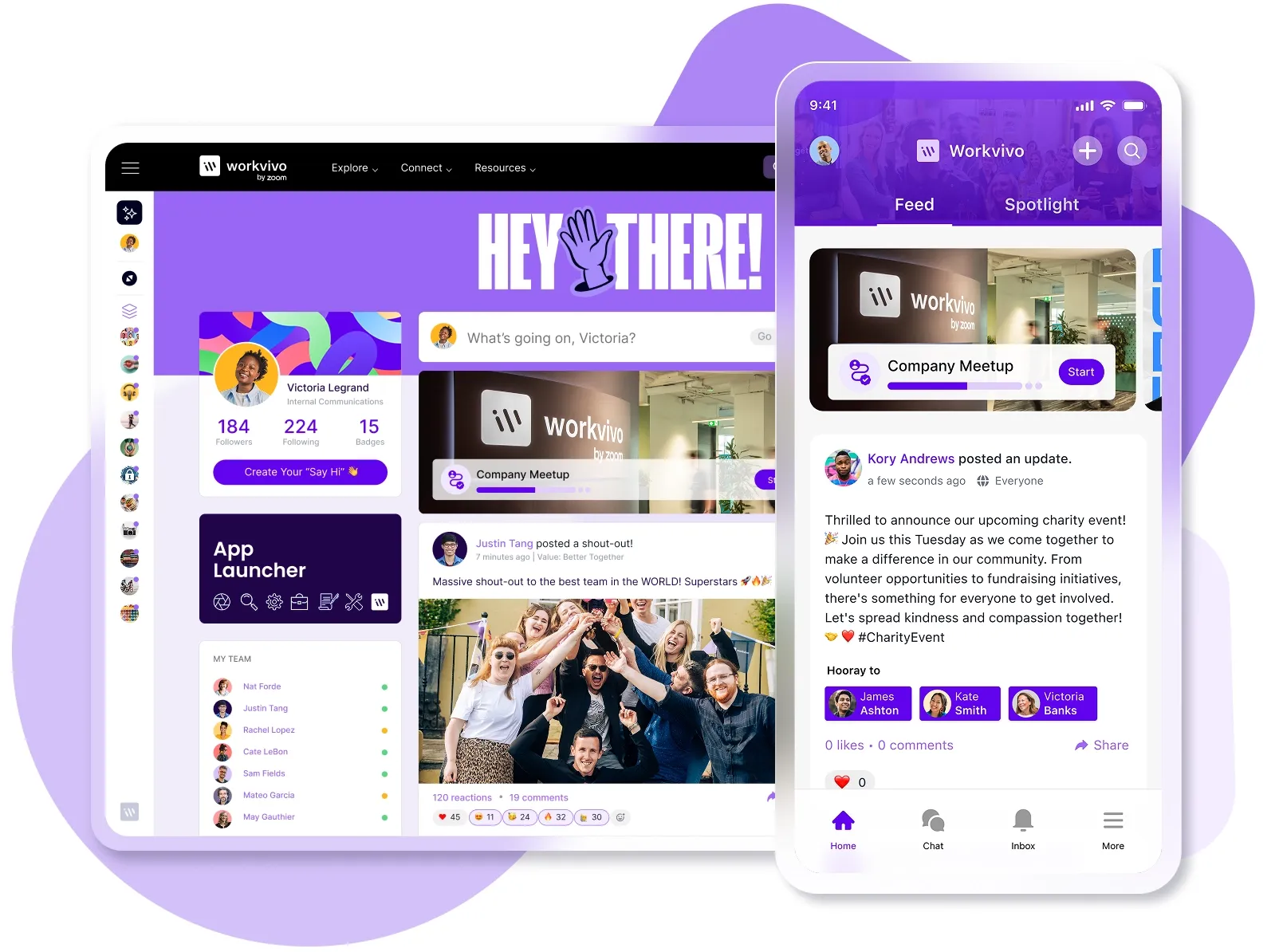
The automated way: Specialized platforms (like Workvivo) offer built-in analytics and reporting for internal comms.
- Pros: Real-time data, no manual entry, and visual consistency.
- Cons: Requires investment in a dedicated platform.
Related reading → 10 Reasons Building Your Own Intranet Is a TERRIBLE Idea
Step 4: Establish your benchmarks
Data without context is meaningless. If your latest newsletter got a 40% open rate, is that good or bad?
Internal benchmarks: Look at your historical data. “We usually get 30%, so 40% is a win.”
External benchmarks: Compare against industry standards. (e.g., Average internal email open rates often hover around 60-70%). Establishing these baselines allows your internal communications team to instantly spot when communication efforts are overperforming or underperforming.
Step 5: Review and iterate with stakeholders
Schedule a quarterly review with key stakeholders (HR, Leadership) to ensure the data is still relevant.
- Are these KPIs still aligned with business strategy?
- Do we need to track new initiatives?
- Is the data helping us optimize our content?
If the dashboard isn’t changing how you work, it needs to be updated.
Turn metrics into movement with Workvivo
You shouldn't need a data science degree to understand your internal communications. While manual spreadsheets can tell you what happened, they can’t tell you why – or help you fix it in real-time.
Workvivo replaces the guesswork with a central hub for employee listening. It combines powerful analytics with intuitive engagement tools, allowing you to measure sentiment and take action to improve it immediately.
Why leading companies choose Workvivo:
- Understand your audience: Use Content Analytics to identify the stories your people love and Campaign Analytics to double down on your most effective initiatives.
- Listen at scale: Get a direct line to every employee with Surveys & Polls that uncover honest feelings and feedback in real-time.
- Amplify your culture: Go beyond clicks by measuring the impact of your company goals. Tag posts to specific values to see how your culture is living in daily interactions.
- Secure your system: Keep your platform safe with Governance Analytics, giving you a bird’s-eye view of user roles and permissions.
- Work smarter with AI: Leverage Workvivo AI as your virtual assistant to elevate employee experiences and make communication effortless.
And more.
Don’t just measure engagement – improve it with actionable analytics. Book a demo today to see Workvivo in action.
FAQs
How does a dashboard contribute to effective internal communication?
A dashboard transforms communication from a guessing game into a science. By visualizing reach and engagement data, you ensure that effective internal communication is not just an aspiration but a measurable reality. It allows you to base your strategy on facts rather than assumptions, leading to better decision-making for the business.
What role do analytics play in the future of work?
As the future of work becomes increasingly hybrid and distributed, you can no longer rely on visual cues in the office to gauge morale. Internal communications trends are shifting toward data-driven insights, with dashboards serving as the organization's eyes and ears, ensuring no employee feels disconnected.
How can I optimize my internal messaging using data?
Data allows you to see exactly which internal messaging formats resonate with your audience. If your dashboard shows that video posts get 50% more interaction than text, you can adjust your employee communication strategy to prioritize video, ensuring higher engagement from team members.
Discover more content on internal communications:
- What Is Internal Communications? The Complete Guide to Effective Employee Communication
- How to Create an Internal Communications Plan in 6 Steps
- Internal Communications Analytics: How to Measure What Matters
- How to Create an Effective Internal Communications Content Strategy
- Fixing the “Great Detachment”: How to Improve Employee Engagement through Internal Communication
- Internal Communication Software Cost: Pricing Models, Features, and What to Expect
- Simpplr Review for 2026: Pros, Cons, Features & Pricing
- Slack Pros and Cons for 2026 [And Better Alternatives]
- 15 Best Enterprise Collaboration Tools Reviewed for 2026
- 10 Essential Internal Communication Channels to Optimize This Year
- How to Set Practical Internal Communications Goals [with Examples]
- The Ideal Internal Communications Team Structure for 2026
- Internal Communications Benchmarks for 2026: How Does Your Internal Comms Strategy Stack Up?
- Internal vs External Communication: What's the Difference?
- 12 Benefits of Internal Communication in the Workplace
- How to Build a Great Internal Communications Dashboard [Key Functionalities, Metrics to Include & Examples]
- The Top 11 Benefits of Unified Communication Platforms
- Internal Communication Software Security: Key Risks and Best Practices for 2026